I'm sorry it's taken me so long to post photos of the bathroom! It's not 100% done yet, but this is pretty darn close. We opted for affordable tile: Standard white subway tile, black bullnose tile and a vintage-ish hexagon pattern for the floor. For both the walls and the floor we opted for easy-to-maintain charcoal-colored grout. I wanted the darker grout to create the outlined effect around the tiles.
The medicine cabinet is pretty standard issue: It bothers me that it's not centered over the sink, but we would have lost a lot of storage space if we limited ourselves to the 24" wide models for the sake of symmetry. To the left hangs a vintage mirror I've had for a while.
The toilet and sink cabinet match well (note the tiered bevelled edge on the sink and the toilet tank top), but they weren't sold as a set. The cabinet was a very affordable model from Lowe's. We sprang for a pretty fancy toilet, which my husband rationalized the cost of by saying, "Well, we'll use it every day." True enough!
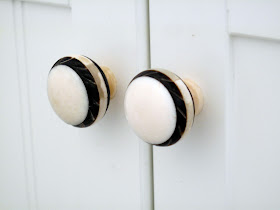
We gave the Lowe's sink cabinet a little jolt of vintage style with these cute black-and-white knobs from Anthropologie (the ones that came on the cabinet were pretty cheese-y).
Here's a shot of the inside of the shower. Not pretty, I know, but I wanted to show you how the window is framed with the black bullnose tile. The stone on the window sill is a big improvement from the previous tiling.
This is the other end of the shower: Our awkward nook. I store our drying rack and washtub there. The stone was cut to fit the space and installed on a slight tilt so the water runs off of it. You can sort of see that the subway tile goes all the way to the ceiling.


what a clean and beautiful design!! i don't own, but my bathroom is only slightly less important than my kitchen. it looks awesome - great job!
ReplyDeleteIt looks really terrrific. Will you put up the train rack? The floor is like the one we did in Norwalk--and grey grout is always the way to go!
ReplyDeleteVery, very nice! As the former owner of a bathroom with lots of white subway tile and black and white hex tile floor, I congratulate you on your impeccable taste. Enjoy it. Life's too short to live for long with an ugly bathroom.
ReplyDeleteI didn't realize I was stealing your style! Glad you think it looks good.
ReplyDeleteLove!! We've been looking for a vanity forever that is affordable! I thought of Lowe's, but never thought their designs looked good. This actually does not look bad. The floors are so awesome!!!!
ReplyDeleteThanks for all the kind words! The vanity is the ESTATE by RSI 25" White Boardwalk Bath Vanity with Top -- it cost $148.
ReplyDeleteDid you replace the tub itself or use some sort of enamel covering? We are in a similar situation with a bathroom remodel.
ReplyDeleteWe replaced everything: The old tub was in good shape, but it was brown. All my research indicated that the various spray options are NOT a good idea.
ReplyDeleteI think your bathroom looks amazing! I'm planning to buy the same vanity - what brand & style faucet did you choose?
ReplyDeleteIs your hex tile marble or porcelain?
ReplyDeleteOur Family, the tile is glossy ceramic/porcelain. Similar to this tile from Home Depot: http://www.homedepot.com/p/Merola-Tile-Metro-Hex-Glossy-White-with-Black-Dot-10-1-4-in-x-11-3-4-in-Porcelain-Mosaic-Floor-and-Wall-Tile-8-54-sq-ft-case-FXLMHWBD/202034845#.UoJv02RgbIU
ReplyDelete