Our decor won't change too much in our new apartment (the same old stuff came with us to Queens, of course). However, starting over fresh in a new space, definitely has me rethinking our decor a little.
Our new building was completed in 1946, so it has a little bit of a pre-war, mid-century feeling (though there is nothing architecturally interesting about it at all). Both my husband and I find ourselves feeling that some of the antique/traditional pieces we bought for our last apartment don't feel quite right for this new one. Plus, some of them just don't fit the space.
I'm also hoping to apply
my aspirations to live with less to our decor. We got rid of a ton of stuff pre-move, which felt great, but I think there will be even more to go as we settle in here. Right now it feels so good to be in this space that is much less cluttered than our old one.
Here are some of the homes that are currently inspiring me:
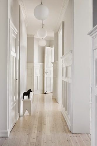
I can't count the number of times I've turned to Remodelista editor Julie Carson's Mill Valley home (above and below) in the
Remodelista book. To me, it's the perfect modern home: It's light, open and spare, yet also lived-in and full of personality.
If only I had the budget to hire Buttrick Won Architects to revamp my little 2-bedroom! One of the things I most admire in Carson's home are all the clever built-ins, which won't be something we can afford to copy. For the best tour of Carson's house, pick up a copy of the Remodelista book, and for a quick tour, check out this
slideshow on Refinery29.
Another apartment that is currently inspiring me is Thom Browne's Manhattan apartment, which is as crisply tailored as his clothing designs. I love pretty much everything about it--and my husband does too. You can take a
virtual tour on Architectural Digest's site.
Tom Scheerer is my hero when it comes to decor, but many of his interiors are a little more old-fashioned and preppy than I am thinking our new place will be. However, his own Manhattan apartment and office both fit the profile of the modern, urban look I am hoping to achieve. Head to the "town" section on his portfolio site, and
click on Gramercy Park Apartment to see more of this lovely space.
Another inspiring home is right here in the new neighborhood! The Jackson Heights home of Jesse James and Costas Anagnopoulos is traditional, yet feels fresh. I'm erring on the side of fewer objets than you see here, but I like the feeling this apartment exudes. There's
a full house tour on Remodelista, if you're curious to see more.
Want to see more inspiration? Check out my
Pinterest board for the apartment's decor.